Category: Branding & Design
Colors speak before words do. When customers see your logo, color creates an immediate emotional impression that shapes how they perceive your brand. Choosing the wrong colors can send mixed messages, while the right colors reinforce exactly who you are and who you serve.
At Extatic Design, we design logos with strategic color choices that communicate the right message. Let's explore what different colors say about brands and how to choose colors that align with your business identity.
Research shows that color increases brand recognition by up to 80%. According to Colorcom, people make subconscious judgments about products within 90 seconds, and up to 90% of that assessment is based on color alone. Color isn't decoration; it's communication.
Different colors trigger different psychological responses. These associations develop through cultural conditioning, natural connections, and repeated exposure. Understanding these responses helps you choose colors that support your brand message.
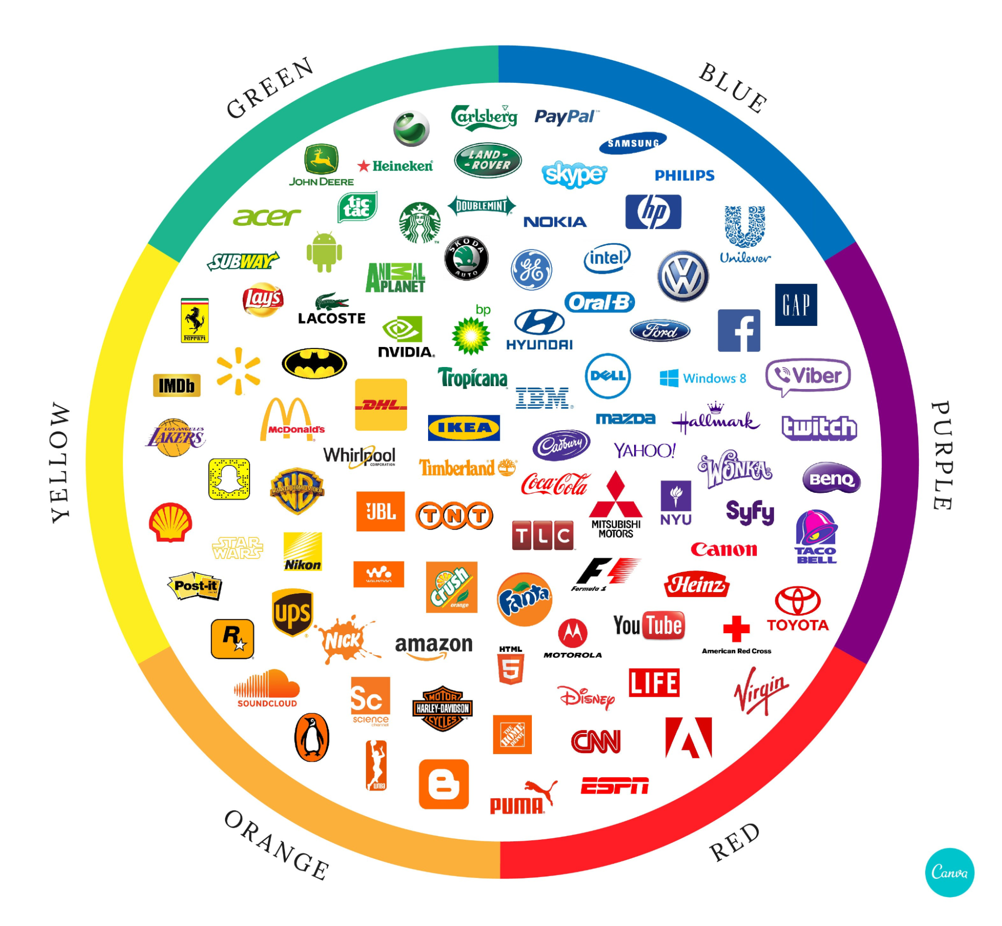
Red demands attention. It's the color of passion, excitement, urgency, and action. Red increases heart rate and creates a sense of immediacy, which is why sale signs and clearance tags use it so frequently.
Best for: Food brands, entertainment, sports, sales-driven businesses. Think Coca-Cola, Netflix, YouTube, and Target.
Consider carefully if: Your brand emphasizes calm, luxury, or trustworthiness over excitement.
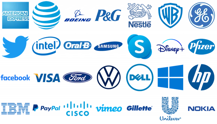
Blue is the world's most popular color and the dominant choice in corporate branding. It communicates trust, reliability, security, and professionalism. Blue has a calming effect and creates sense of stability.
Best for: Finance, technology, healthcare, corporate services. Think Facebook, IBM, PayPal, and American Express.
Consider carefully if: Your brand needs to stand out in industries where blue is overused, or if you want to convey warmth and approachability.
Green connects to nature, health, growth, and environmental responsibility. It's calming like blue but with added associations of freshness, renewal, and balance. Green also connects to money and prosperity in many cultures.
Best for: Health and wellness, organic products, environmental organizations, finance. Think Whole Foods, Starbucks, Animal Planet, and John Deere.
Consider carefully if: Your brand has no natural connection to nature, health, or growth themes.
Yellow radiates optimism, happiness, and warmth. It grabs attention and creates feelings of cheerfulness and friendliness. Yellow stimulates mental activity and generates feelings of energy without the intensity of red.
Best for: Children's brands, entertainment, food, creative industries. Think McDonald's, IKEA, Snapchat, and National Geographic.
Consider carefully if: Your brand needs to convey sophistication or seriousness. Yellow can appear cheap if misused.
Orange combines red's energy with yellow's friendliness. It's enthusiastic, creative, and approachable. Orange feels playful without being childish and confident without being aggressive.
Best for: Creative agencies, sports teams, youth-oriented brands, call-to-action buttons. Think Nickelodeon, Fanta, Harley-Davidson, and Amazon's smile.
Consider carefully if: Your brand emphasizes luxury, elegance, or conservative professionalism.
Purple historically signified royalty because purple dye was rare and expensive. Today it still communicates luxury, sophistication, creativity, and wisdom. Lighter purples feel romantic; darker purples feel regal.
Best for: Luxury brands, beauty products, creative services, spirituality. Think Cadbury, Hallmark, Twitch, and Yahoo.
Consider carefully if: Your brand targets male-dominated audiences, as purple often skews feminine in perception.
Black communicates sophistication, luxury, power, and elegance. It's timeless and authoritative. Black creates strong contrast and works with virtually any other color, making it versatile in design applications.
Best for: Luxury brands, fashion, technology, high-end services. Think Chanel, Nike, Apple, and Prada.
Consider carefully if: Your brand needs to feel approachable, cheerful, or budget-friendly.
Consider your target audience, industry norms, brand personality, and competitive landscape. What emotions should your brand evoke? What do competitors use, and how can you differentiate? Test color choices with real customers before finalizing.
Strategic color choices strengthen brand identity and communicate effectively before a single word is read. Understanding color psychology helps you make intentional decisions that support your brand's message and goals.
Need help choosing the right colors for your logo? At Extatic Design, we create logos with strategic color palettes that communicate exactly what your brand represents. Contact us today to discuss your brand identity. Let's find the colors that tell your story!