Category: Design & Marketing
In a world drowning in information, infographics cut through the noise. They transform complex data into digestible visuals that people actually want to consume and share. When done well, infographics educate audiences, build brand authority, and generate significant engagement across platforms.
At Extatic Design, we create infographics that make information beautiful and accessible. Let's explore how to design infographics that inform, engage, and get shared.
The human brain processes visual information 60,000 times faster than text. Infographics leverage this by presenting data in visual formats that are quicker to understand and easier to remember.
According to HubSpot, infographics are liked and shared on social media three times more than other content types. They're powerful tools for content marketing, education, and communication. When complex information needs to reach broad audiences, infographics deliver.
Before designing anything, define what your infographic needs to accomplish. What information are you communicating? Who is your target audience? What action do you want viewers to take? What's the one key takeaway?
A focused purpose keeps your infographic from becoming cluttered or confusing. Every element should support your main message. If something doesn't contribute to your purpose, leave it out.
Different types of information call for different infographic formats. Choosing the right structure helps viewers understand your content more easily.
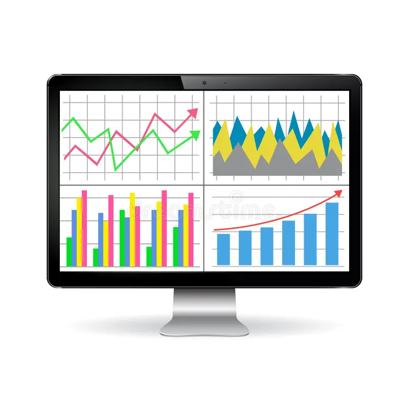
Statistical Infographics: Best for presenting survey results, research findings, or data-heavy content with charts, graphs, and numbers.
Timeline Infographics: Ideal for showing historical progressions, project phases, or step-by-step processes over time.
Process Infographics: Perfect for explaining how something works, workflows, or instructions with sequential steps.
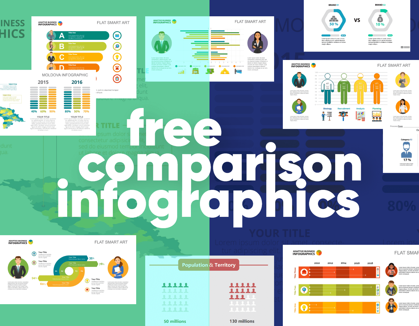
Comparison Infographics: Great for contrasting options, showing pros and cons, or highlighting differences between choices.
List Infographics: Effective for tips, resources, or any collection of related items that benefit from visual organization.
Great infographics are built on solid data. Gather information from credible sources and verify accuracy. Cite your sources within the infographic to build credibility with viewers.
Be selective about what data you include. More isn't always better. Choose the most compelling statistics and facts that support your main message. Too much data overwhelms viewers and dilutes impact.
Visual hierarchy guides viewers through your infographic in the order you intend. Use size, color, and position to indicate importance. The most critical information should stand out immediately.
Most infographics flow from top to bottom, so place your hook at the top. Break content into clear sections with headers. Use visual cues like arrows, lines, or numbered elements to guide the eye through the narrative.
Color does heavy lifting in infographics. It attracts attention, organizes information, creates mood, and reinforces brand identity. But too many colors create chaos rather than clarity.
Stick to a limited color palette, typically three to five colors. Use one or two accent colors to highlight key information. Ensure sufficient contrast for readability. Consider color-blind users by not relying solely on color to convey meaning.
Different data types call for different visualization methods. Bar charts compare quantities. Line graphs show trends over time. Pie charts display proportions of a whole. Icons and pictograms represent concepts visually.
Choose visualizations that make your data immediately understandable. Avoid chart types that require explanation or could mislead viewers. Accuracy and clarity should never be sacrificed for visual interest.
Infographics should show more than they tell. Lengthy paragraphs defeat the purpose. Use short headlines, brief labels, and concise explanations. Every word should earn its place.
Choose fonts that are readable at various sizes. Maintain typographic hierarchy with clear distinctions between headlines, subheads, and body text. Sans-serif fonts typically work better for data labels and small text in infographics.
If you want your infographic shared, design with sharing in mind. Include your logo and website URL so credit travels with the content. Create versions optimized for different platforms, as Pinterest, Instagram, and LinkedIn have different optimal dimensions.
Make it easy for others to embed your infographic by providing embed codes. Consider creating a shorter version for social media that links to the full infographic on your website.
Before publishing, review your infographic critically. Is the main message clear? Does the visual flow make sense? Is all data accurate and properly cited? Test comprehension by showing it to people unfamiliar with the content and asking what they take away.
Great infographics combine solid data, clear purpose, and thoughtful design to create content that educates and engages. They transform information from forgettable to shareable, from complex to accessible.
Ready to create infographics that inform and engage? At Extatic Design, we design custom infographics that make your data beautiful and your message memorable. Contact us today to discuss your infographic project. Let's transform your information into visual content people want to see and share!