Category: Branding & Design
Colors speak louder than words. Before a customer reads a single line of text on your website or marketing materials, the colors you've chosen have already made an impression. They've triggered emotions, created associations, and influenced whether that person feels drawn to your brand or pushed away.
At Extatic Design, we understand that color selection is both an art and a science. The right colors can boost conversions, strengthen brand recognition, and connect with your target audience on a deeper level. Let's explore how color psychology works and how you can use it to make design choices that actually sell.
Color psychology is the study of how colors affect human behavior and decision-making. While individual responses to color can vary based on personal experiences and cultural backgrounds, research has identified consistent patterns in how colors influence emotions and actions.
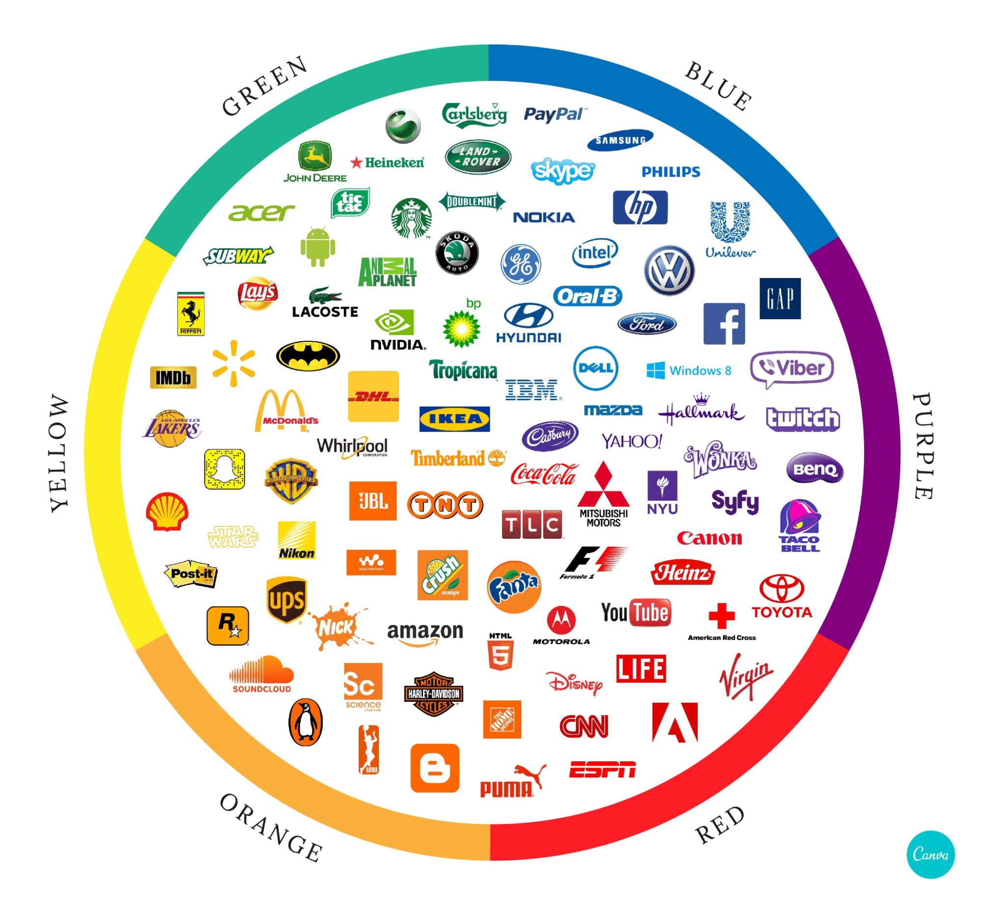
According to research published in the Journal of Business Research, up to 90% of snap judgments about products can be based on color alone. Another study found that color increases brand recognition by up to 80%. These statistics highlight why strategic color selection should be a priority for any business looking to connect with customers.
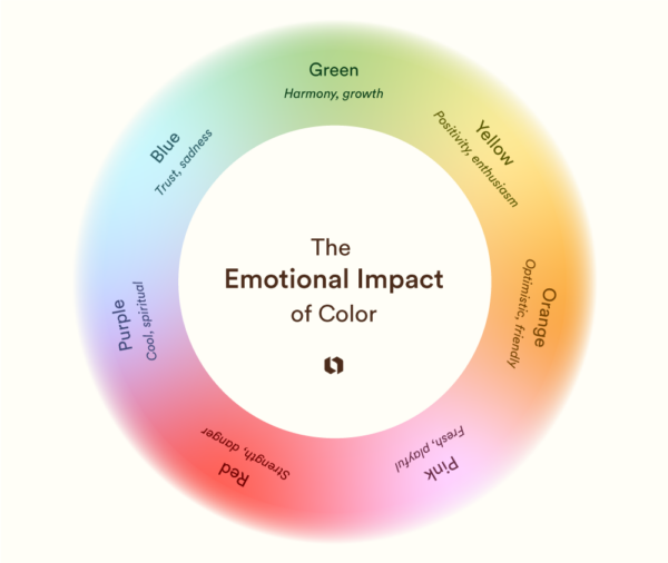
Each color carries its own psychological associations and emotional triggers. Understanding these can help you select colors that align with your brand message and appeal to your target audience.
Red: Red is the color of energy, passion, and urgency. It increases heart rate and creates excitement. Retail brands often use red for clearance sales because it triggers impulse buying. However, red can also signal danger or aggression, so it should be used strategically.
Blue: Blue conveys trust, security, and professionalism. It's the most popular color for corporate brands, particularly in finance, technology, and healthcare. Blue has a calming effect and suggests reliability, making customers feel safe doing business with you.
Green: Green represents nature, health, growth, and wealth. It's perfect for eco-friendly brands, wellness companies, and financial services. Green is easy on the eyes and creates feelings of balance and harmony.
Yellow: Yellow radiates optimism, happiness, and warmth. It grabs attention and stimulates mental activity. Brands targeting younger audiences or wanting to appear friendly and approachable often incorporate yellow. However, too much yellow can cause anxiety.
Orange: Orange combines red's energy with yellow's friendliness. It suggests enthusiasm, creativity, and confidence. Orange works well for calls to action and is popular with brands targeting active, adventurous audiences.
Purple: Purple has long been associated with royalty, luxury, and sophistication. It also suggests creativity and imagination. Beauty brands, premium products, and creative services often use purple to convey quality and exclusivity.
Black: Black communicates elegance, power, and sophistication. Luxury brands frequently use black to create a premium feel. It's also versatile as a neutral that pairs well with almost any other color.
While general color associations provide helpful guidelines, your specific audience's preferences matter most. Different demographics respond differently to colors, so understanding your target market is essential for effective color selection.
Research from HubSpot indicates that men generally prefer bold colors like blue, green, and black, while women often favor softer colors like blue, purple, and green. Age also plays a role: younger audiences tend to respond to brighter, more vibrant colors, while older demographics often prefer more subdued, traditional palettes.
Cultural context matters too. Colors carry different meanings in different cultures. White represents purity in Western cultures but mourning in some Eastern cultures. Red signifies luck and prosperity in China but can represent danger in Western contexts. If you're targeting international audiences, research cultural color associations carefully.
Strategic color use can significantly impact your conversion rates. Here's how to apply color psychology to encourage desired actions:
Call-to-Action Buttons: Your CTA buttons should stand out from the rest of your design. Contrasting colors draw attention and encourage clicks. Orange and green buttons often perform well in testing, though the best choice depends on your overall color scheme.
Trust Signals: Use blue tones around areas where you need to build trust, such as checkout pages, contact forms, and security badges. Blue's association with reliability helps reassure hesitant visitors.
Urgency and Sales: Red and orange create urgency and excitement. Use them for limited-time offers, sales announcements, and flash deals to trigger faster decision-making.
Effective design rarely relies on a single color. Instead, brands use carefully selected color palettes that work harmoniously together while serving different purposes within the design.
A typical brand palette includes a primary color that represents your brand's main personality, secondary colors that complement and support the primary color, and accent colors used sparingly for highlights and calls to action. Neutral colors like white, gray, and black provide balance and ensure readability.
At Extatic Design, we develop comprehensive brand color palettes that consider both psychological impact and practical application across all your marketing materials, from websites to business cards to social media graphics.
Color psychology provides valuable guidelines, but the only way to know what works best for your specific audience is through testing. A/B testing different color variations can reveal surprising insights about what resonates with your visitors.
Test one element at a time to isolate the impact of color changes. Start with high-impact elements like CTA buttons and headlines, then move to broader design elements. Track metrics like click-through rates, conversion rates, and time on page to measure results objectively.
Color is one of the most powerful tools in your design arsenal. The right palette can attract your ideal customers, communicate your brand values, and drive conversions. The wrong colors can confuse visitors and undermine your message.
Ready to harness the power of color psychology for your brand? At Extatic Design, we create strategic color palettes that connect with your audience and drive results. Contact us today to discuss your branding needs. Our design experts will help you choose colors that not only look beautiful but also work hard to grow your business. Don't leave your color choices to chance. Let's create a palette that sells!